Logos are the ‘visage’ of a firm or organisation. A logo is not only the graphical representation of a company but it is also an unsaid image of the company in the consumer’s subconscious. The composition of logo including its size, style, colour and the design collectively defines a company in the advertising and marketing sector. It is a lot more than just being a piece of graphics on the top of any web page or visiting card.
If so much is the importance of a small logo in the outer world, then the next question would definitely be as to how can one create a good logo and how does one measure its impact on the user(s)? How does the designer understand the essentials of logo design? Well, the answer lies in the question itself.
Logos can be entitled as good only if they are unique and comprehensible to the potential customers. ‘Potential clients’ is something that needs to be focused here. Identifying and understanding the target audience and their taste, on an average will solve half of the dilemmas of the designers. Moreover, logos should distinctly convey the company’s name or message regarding the services it provides. For example, the Pizza Hut logo has pizza hut written within itself along with a hat at the top to signify hut. A smart logo that conveys the company’s intentions loud and clear will be a trust icon on the consumer’s mind. More known the company is, more the number of customers that will be bound to it.
A perfect logo is not only the one that is designed in its best way but it is also the one which perfectly aligns with the contents of the website. Eye-catching, unique and well-thought of logos for any company are cherished for an elongated time. Below given are a few stepping stones to obtain a perfect logo design in order to put strong feet forward in today’s market.
Size and Placement
A logo should be legible and decipherable regardless of its size. This should be done in such a way that the logo does not overshadow the text content. Placement of the logo in the corner of the design creates a distinct impact as it makes the content look more organized and symmetric. Moreover, the size of the logo should be such that it does not look clumsy or over-the-top designed nor should it make the customers feel that the brand trying to promote itself too much.
Design
The design of the logo is a straight path towards a perfect marketing icon creation. The design of the logo should be such that it is adaptable across various media platforms. The design should inculcate enough white spaces in order to make the logo look clean. Studying colour psychology also helps in improving the designs. Too much font is not a pleasant idea to follow through as this is not identified as a professional practice. Moreover, too much vibrancy in colour also makes the design look unorganized and difficult to comprehend by the customer. Also, if there are any pictures to be included in the design other than the graphics, the size must be of at least 300 DPI.
Uniqueness
The world has had enough of stereotypes. People are always searching out for something unique in all aspects and this follows into logo design as well. Creative, unique and well-thought of logos create an everlasting impact upon the eyes of the beholder. Something out-of-the-box is always appreciated and remembered. If following trends are what you opt for, you are in turn robbing yourself of your own creativity.
Non-Redundancy
Too much showcasing off of your logo is a big no-no. If a logo appears too many times in front of a customer, he indirectly feels the brand to be cheap and one which needs intense marketing. This creates a negative impact on their minds. Hence, redundancy is a big pull back while designing and bringing together the content and the logo.
Consistency
Skipping over various new logo designs over a short period of time indirectly gives a much shorter time for the audience to connect themselves with the logo. This not only makes the brand look weak but also adds to its inconsistency and unreliability.
Simplicity
‘Keep it simple’ is a must-follow mantra. Too much of creativity should never be a cause to shift the focus from the original goal of logo design; i.e. to connect with the audience. Smart but simple logos are the best set of logos that run the market today.
Getting feedback from others
The final and mandatory step in a logo design is to take reviews from a set of audience. Get to know what people think about your ideas. Also, find out whether your ideas are appreciated by the majority or not. Here, care needs to be put into studying the feedbacks well and analysing them before altering anything.
Illustrations are the best medium to learn something. They individually have qualities which can be hand-picked and incorporated in our designs as and when required. Given below are examples of few companies which have well-thought of and inspiring logo designs.
Flight Finder

Flight Finder is a firm used by people to search and book online flights from one location to another. Given below is their unique logo. The white space between the two F’s takes the shape of an aeroplane.
Baskin Robbins
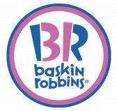
Baskin Robbins is one of the world’s largest chains of speciality ice-cream shops named after its founders Burton Baskin and Irvine Robbins. Baskin Robbins has 31 flavours – check the ‘B’ & the ‘R’ in the logo.
Amazon

Amazon started out as a small bookstore in 1994. Since then, its unstoppable growth and extension of products from books to music, DVDs, sports equipment and much more has directed it into becoming a strong competitor in the national as well as international market circle. Amazon’s logo signifies a smile from A to Z. This conveys that Amazon provides customer’s happiness by giving them everything they want.
Sony Vaio
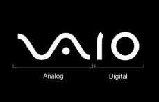
This is a sub-brand for many of Sony’s computer products. The logo given below contains a smart blend of digital and analogous signals used to depict a product that converts audio and video signals to give meaningful outputs. The ‘V’ and ‘A’ in the logo depicts the analogous waves whereas the ‘I’ and ‘O’ stand for digital waves.
In a nutshell, the world of creativity is endless and so is the list of innovations in the logo world. This logo world is like a deep sea. The deeper you explore, the more beautiful it is. Only experience and constant practice will unlock all the doors of knowledge and understanding for a perfect representation of your brand in today’s ever competing market. So explore, think and implement. Great works mostly happen while we are going through a process!
Tell us how you feel about this blog post and share your logo story in commet section
By Margi Mehta