Photo by Shingi Rice on Unsplash
Visual aids are necessary to promote any brand. Social media posts, stories, and posters are the most common methods of doing so. Designing them is not as easy as you think.
With the advent of platforms such as Canva, everyone thinks they can easily design a post. That is not true at all. A lot of effort goes into making a visually appealing poster.
Graphic designers and other creative personnel put a lot of effort into designing each social media post and other posters. Even things like product packaging, boxing, instruction card, cover page, and other elements are designed with a lot of precision. This is done to grab and maintain the viewer's attention.
So, let's go behind the scenes and discover what goes into designing any creative piece.
Elements of Design
Line – line is one of the key ingredients that goes behind designing any visual. The direction, thickness, and flow of the lines convey the mood of the image. Horizontal lines indicate calmness and stability whereas vertical indicate balance and alertness. Thin lines represent fragile and elegance whereas thick ones show strength and emphasis.
Shape – there are 3 types of shapes
- Geometric shapes- that is circles, squares, triangles, and other regular recognizable shapes.
- Natural/organic shapes- these shapes have more curves or are uneven. They are pleasing to the eye and resonate with nature. Examples are leaves, clouds, and pebbles.
- Abstract shapes- they are recognizable shapes but not real. They are styled or simplified.
Different shapes have a different meanings. For example- squares and rectangles show stability, triangles represent action, aggression, the tension so on and so forth.
Mass/Form – mass means the size. It refers to the height, width, and depth of the piece. There are 2 types of views – physical view and digital view. According to this view, one should decide the dimensions and make accordingly.
Texture – refers to the characteristics of a surface or an object. It can be tactile as well as visual. It adds a 'real-life' effect to the piece. It creates a 3D appearance on a 2D surface.
Space – gaps between the visual elements are called the negative space. This space is needed to highlight the main elements of the visual. The closer the elements are difficult it is to read and understand the poster.
Space makes the writing legible and easy to read. It also adds aesthetic appeal and a breather to the piece.
All of these elements are used to grab the attention of the viewer.
Do you know how to effectively use these elements to create an amazing visual?
If not let's jump straight to it.
Centre of attention
Whenever you see a poster the first place where your eyes go is the center of attention. It's the most important part of the poster and it needs to be eye-catching and communicative.
 Rule of the Thirds
The rule of the thirds is the main rule in the composition of any artwork. It stems from the theory that the human eye naturally gravitates to intersection points that occur when an image is split into thirds.
The intersection points are the focal points where you can add the most important portion of your visual.
An example to understand this better would be – whenever you take a picture from your mobile the screen will show the grid of the rule of thirds and focus on the scenery accordingly.
After grabbing the attention your poster needs to have a flow. One element should lead to another. Then only the viewer will go through everything on your poster.
Lines and shapes should be used to show where the viewer should go next.
Color
A crucial part of the poster is its color. Color plays a major role in attracting people, heightening emotions and feelings, making them want to read more or scroll away. Colors also express feelings. Red indicates anger and danger; blue indicates peace and tranquility and so forth.
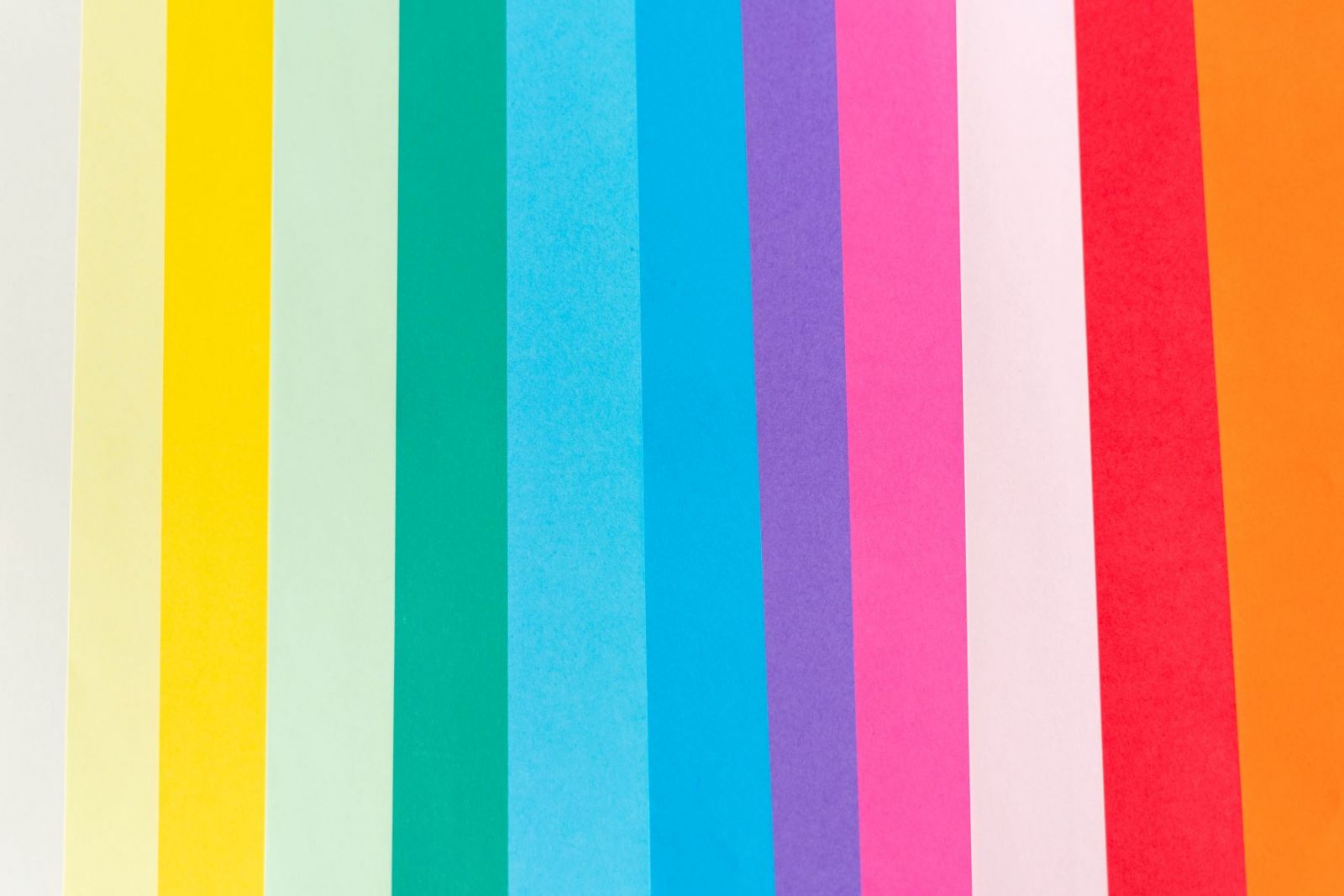 Various Hue's
Using colors appropriately is the key to letting the viewers know what the product or service is about. You can reflect your brand image via colors. For example, most companies that project a trustworthy and stable image use the color blue.
Color has the following 3 characteristics-
- Hue- the hue is the basic color such as red, green, and purple.
- Value- lightness or darkness of the hue is called value. The more you add white to the color it becomes lighter and is called a tint. The more you add black it becomes darker and is called a shade.
- Intensity – the brightness or dullness of color is referred to as its intensity. The brighter the color the more intense it is and vice versa.
These are some of the many things that are thought about before making a visual. Many careful considerations are taken to project the right image to the viewers.
---------
Shimbi Growth Labs
The team that helps you grow your business!
Sign up below for our newsletter to receive exclusive business growth tips in your mailbox
Established in 2005, Shimbi Labs was born with the idea of developing simple, powerful yet affordable software for freelancers and small businesses to help them grow.
Shimbi Labs is the creator of
Budo - Simplest Website Builder
Ninjin - Easiest Online Store Builder
Shimbi Invoice - Online Invoicing made easy.