“Design is not just how it looks like and feels like. The design is how it works.” Steve Jobs.
In the ever-changing technological world of today, there is only one metric that matters when it comes to conversions via apps - engagement. Moreover, one of the basic ways to drive it is to have a killer app user interface that delivers a memorable experience to users.
The reason is simple. However good the functioning of your app may be, you would miss out on a considerable amount of leads if it does not appeal your users visually.
After all, nobody wants a superhero without his cape.
So, let’s look at five tips that would help you design the perfect app for your target audience:
1. Use an Interactive App Design
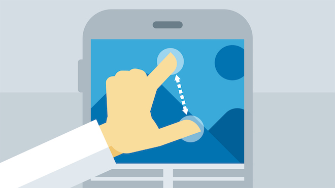
Image Source
Interaction is directly proportional to engagement and is a crucial component of both UI and UX. And make no mistake, it is not easy to come up with. To successfully implement an effective interactive app design, you need to get into the minds of your users, logically think through all their actions and behavioral patterns and then tie up the results with the goal of your app.
According to Gillian Crampton Smith and Kevin Silver, interaction designers, there are five components to a powerful interactive design:
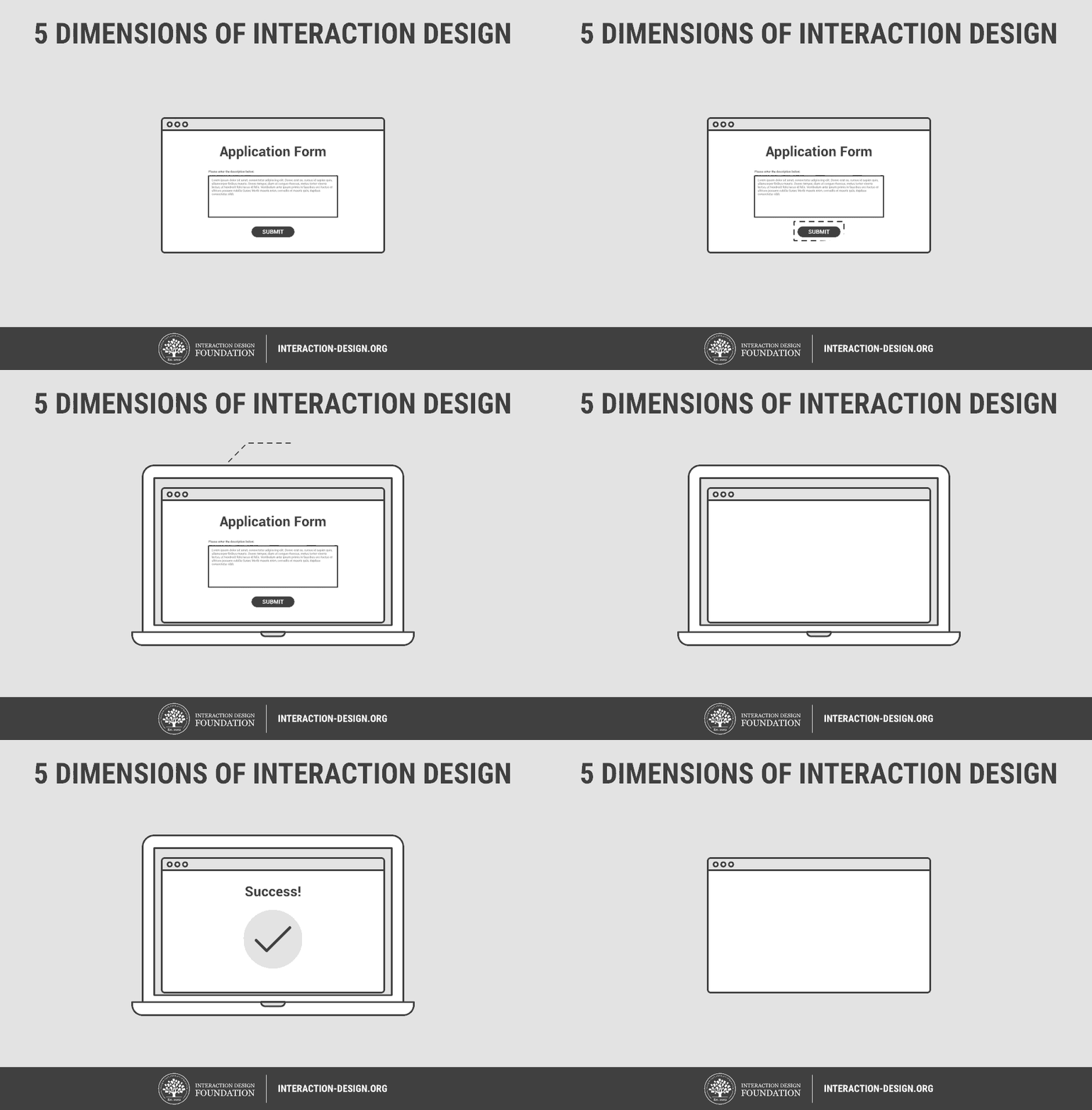
Image Source
- Words - Every information given should be easy to comprehend and provide value to the users.
- Visual Representations - Relevant images, topography, and icons should be deployed with a consistent theme.
- Physical Objects or Space - Which type of devices will the users use to interact with your app? And what kind of physical space is the user in a while doing so? All such factors will affect the interaction between the user and the app.
- Time - This refers to the amount of time that the users spend interacting with your apps. Is there a provision for them to resume their interaction?
- Behavior - Includes the way users interact with the app as well as their reactions and feedback for it.
2. Select the Right Colors
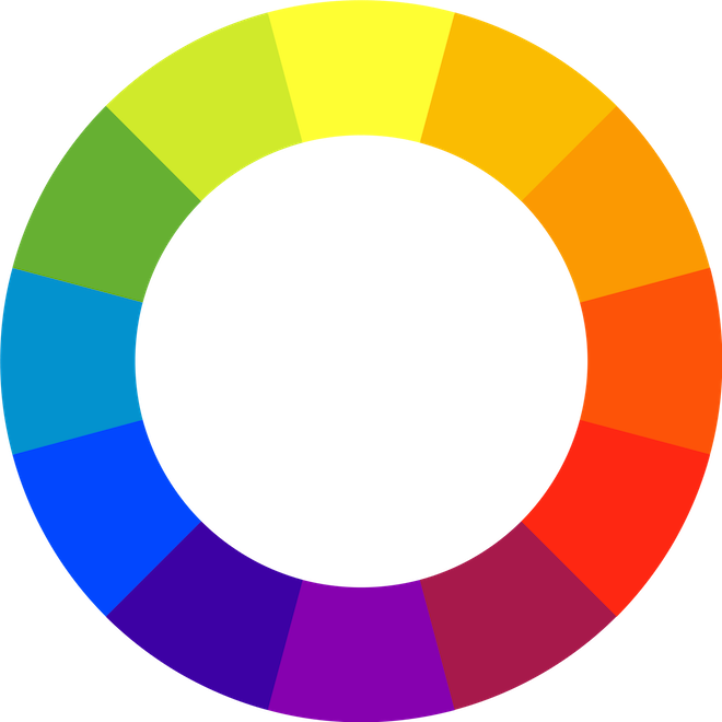
Image Source
Functionality and colors are the two pillars of any app. The color scheme used in the app should stem from a purpose. While we have seen some extensive use of colors when apps first hit the market, over time developers, have realized the importance of minimalism. Flat designs and color schemes are preferred today as they are gentle on the eyes and boost engagement.
But how do you come up with a color scheme? The 12-spoke color wheel (as depicted in the image above) can come to your rescue. You can read more about it and the various color schemes that stem from it here.
3. Include User-Friendly Gestures
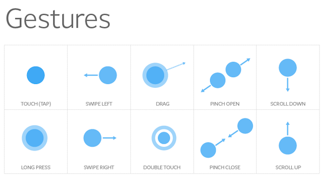
Image Source
No app UI is complete today without the use of gestures. These have been made possible with the advancing mobile hardware and software architectures and have provided new ways to engage with your gadget apart from simple clicking and scrolling. Here is how the gestures help to design a user-friendly app:
- They reduce clutter and make the app cleaner to use since more gestures mean fewer buttons.
- Once the user learns them, they offer fantastic ease of use and reduce the time during redundant tasks.
- They help to make interaction quite intuitive. This makes users engage more and consumes more content.
A crucial point to keep in mind is that while you build your app, the interface should be defined in such a way that it intimates the users about the availability of gestures.
4. Keep the Content Synced
The content needs to be synced with the overall design of the app. This includes the font color, type, size, as well as their placement on the screen. The writing needs to cater to your target audience, and your message should be crystal clear and devoid of any confusion.
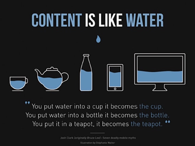
Image Source
But how do you come up with bang-on content? Des Traynor, co-founder of Intercom, gives some useful insight in the form of some helpful questions that you can ask yourself:
- Who will read the content?
- At what time or place will they read it?
- What information do you want them to know?
- What is the next step that you want them to follow?
- What tone/image of your brand do you want to portray?
5. Attention to Detail
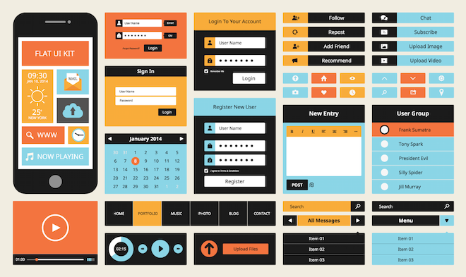
Image Source
Once you have everything basic requirement in place, it is now time to think about every element from user's point of view.
For example, Apple recommends that the size of the CTAs (or Hit Targets) should be at least a square of side 44 pixels to be accurately touched by an average finger.
Here are some more pointers that you need to take care of:
- There should be sufficient contrast between the color of the text and the background so that it is easily legible.
- The layout should be easy to read and responsive to the size of the screen so that the app is accessible on multiple devices.
- Take care of spacing to remove any text or element overlap.
- Use high-resolution images only, or they would tend to get pixelated on large screen devices like phablets or tablets.
- Strategically decide upon the alignment and placement of all elements of the app.
Over to you
Now that you are well aware of the tips, it is time to put them to use. With a little bit of improvisation and flair, you can create a stunning app that your users would fall in love with. Do not forget to share your experiences with us in the comment section below!
SaveSave