I always believed that there is a story behind everything. So I love to read stories behind the company names, the company logos, even the fonts used to write the names… it’s exciting! Stories behind the company logo and name of Apple, Nike and Sony are fascinating.
Here is an interesting story behind the new Logo of Shimbi Labs.
One picture worth ten thousand words
However, if that picture is a logo of a company, it has a whole book of interesting stories behind it — a journey of passion, dreams, and efforts of the people behind creating that piece of art.
A logo is not just a combination of pictures and letters. A logo has a much deeper meaning and vision that represents the core values of the company and the guidelines for its future journey. Company logo plays a prominent role in attracting the right clients and talent to work with the company. It builds the first impression of the brand.
In this blog, I will try to explain how we did that. Hope it will be helpful for you in your journey of designing a logo for your startup.
In my previous blog, I shared the story behind the company name ‘Shimbi Labs' which represents our core values and how it is an integral part of our work culture. Software, Website and Mobile Application designed by us are functional, resourceful and most importantly they have an inherent esthetic sense of beauty. Japanese term ‘Shimbi' reflects the same, and hence we named our company Shimbi Labs.
“ShimBi Labs”, the story behind the company name
“A logo conveys the core values of the company and its future path.”
Back then our company logo was very primitive and was designed in haste.
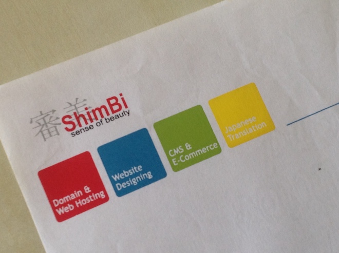 Shimbi Labs first logo
Being a new company, I was much engaged in promoting the company to our niche market - Japan and was more focused on bringing new opportunities for the company. So, when we changed our logo from initial one to a new one, I played a minimal role. That was a mistake!
The logo, which is used for more than a decade, and has become symbolic to our company. Our team members, clients, vendors and other stakeholders recognised it loved it. The logo with petals inside and outside both with multiple colours reflected the company with its vision for external and internal growth and was designed by co-founder Kapil & our first employee Sachin together.
Recently while I was reflecting on the future vision of Shimbi Labs and everything about our organisation, I was embarrassed and shocked when I realised that I did not know the meaning of our logo until recently. I had to get back to them to find out!
The logo was creative, beautiful and well accepted. However, it was not reflecting true us. I was anguished bout our company logo that did not have a story to it. A story, of which we can be proud. The guilt won’t let me think of anything else for a while. It was all that was on my mind.

Shimbi Labs second logo
I decided to work on a new logo for two reasons, one I needed an inspiring story behind the logo and second reason, as times have changed, and so as Shimbi Labs too. Although the values at core remain same, Shimbi Labs has expanded much more in her vision and approach to what we do and how we do. So I thought this is the right time to change the logo to reflect our new aspirations.
“A logo tells who you are, what you believe in and where you are leading! “
Changing a logo is a big challenge. It requires both – a lot of money and time. Additionally, the previous logo was familiar. People identified Shimbi Labs with that logo. I was in a fix for a while. I did not want to lose the brand identity. All our hard work for the last 10 years will go for a toss if that happens. However, I overcame that fear with a new perspective – that the logo should reflect our work, our ideology.
Questioning myself - Who we are? What do we do?
So I start thinking - what do we do? We do software development, web app development, mobile app development... but what is the common thread among these? What is it that defines us? Searching for the answers, I went into our process of work. We gather requirements; we develop technical specifications, HTML design, client feedback, documentation...what else? What is it that we eventually do?
What else? What is it that we eventually do?
Through discussions, brainstorming, solitary thinking, I reached to a point where I saw all these processes as dots. The client requirements are one dot, technical nuances is another dot, documentation is yet another dot and so on... what we do is connecting these dots and story start developing, it takes the shape of what customers imagine about the end product. We then develop – an app or a website – that weaves all these into one logical, functional software.
Here I get back to the initial point – creativity. We innovate, and every innovation needs creative thinking. It requires imagination. Moreover, if we introspect a little, we are already using imagination in every project. That is what connects the dots.
We connect the dots, and the story develops!
A Logo also represents the culture.
However, the logo does not just mean what work we do. It also reflects our culture. Shimbi Labs has always been a place for experiments. We never wanted to make it a 'systematically bound' company. It always has been like an experimental laboratory where we play around with technical stuff to create something amazing, something new that can bring change in the way people work, something that can solve a real-life problem. So it has always been a laboratory (which we kept consistent in its name - Shimbi Labs, and then Shimbi Computing Laboratories Pvt Ltd.
The experimentation is always a fluid thing. It flows from one end to another revealing new theory. Every experiment starts with an assumption and ends by giving birth to a new one, that becomes the base of the next experiment. Sometimes, things are connected in a flow, sometimes they look disconnected, but ultimately the pieces come together to form a great shape.
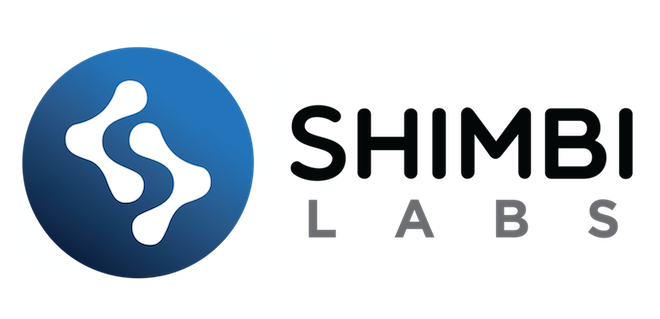
That's a lab - experimenting lab. So we decided to arrange the letter L in such a way that it can be seen connected and a the same time distant, and in between it creates the letter S in a negative space. (A negative space is created by keeping some space between two elements, which forms a shape or letter, without expressly writing it - Check out these excellent examples of famous logos with negative spaces).
ShimBi or SHIMBI?
In my earlier blog about the story behind the company name, I explained how we named our company "ShimBi Labs." Quite interestingly we used the letters with uppercase S and B and start writing it as "ShimBi" to ensure everyone pronounces it correctly as Shim Bi (other than Japanese). That was the first mistake.
Then I hurried to book a domain name immediately after finalising it, the only one I found was shim-bi.com as an available option instead of booking www.shimbilabs.com (which we booked 2009). Little did I realised that eventually, people would learn the pronunciation but they will also mistake it as two different words written together by separating capital letters. That was the second mistake.
It is single word “Shimbi, ” and Shimbi (審美) stands for the esthetic sense of beauty .
I decided to correct it; also I wanted to ensure that it reflects the boldness to experiment, so we made the text with all uppercase and bold “SHIMBI LABS” in our new logo. Uppercase letters show confidence, boldness, risk-taking approach. With the new logo, we want to ensure to send a clear message - we are confident and bold enough to take risks while committing to our values.
Colours have a deeper meaning than they appear.
Colours are the most critical part of any identity. Every colour has a meaning, and it affects the viewer's subconscious mind with its power. Colours in the logo often represent the core values of the company and the message it wants to convey.
For example, blue is the colour of the sky and sea, so it represents "Trust, Truth, and Stability" while red comes from fire, so it represents "Energy, Strength, and Danger." (Now you know why most of the countries have Red on their flag.) While yellow stands for "Happiness," the Green is related to trees and represents "Growth."
At Shimbi Labs, Transparency and Trust are our core values. Our words and action reflect them. We remain transparent with our clients and stakeholders in everything we do. So we preferred Blue to circle our logo while giving the shapes in a White colour that represents "Purity and Perfection."
It's here, Fresh, New & Meaningful!
Now, collectively with the design, text, and colours, when I look back to the new creation we have, I feel, that it reflects who we are, what we believe. "Truth, Trust, Stability, Purity, and Perfection."
Now, whenever someone asks me, what is the story behind Shimbi Labs logo? We have a great story to tell! I am particularly fond of the design, the colours and the aesthetics of our new logo. It reflects everything that we do. I am hoping our customers, and everyone else will also like it.
Famous designer Milton Glaser said, “There are three responses to a piece of design – yes, no and WOW! Wow is the one to aim for.” I think ‘WOW’ will be the response to our logo!
This is us. This is SHIMBI LABS.
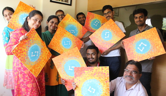
ShimBi Labs team loved to paint abstract of our new logo.
Tell us what you feel about our new logo?